6. ggplot2 绘图
ggplot2 的语法与 R 原生的语法并不统一,但是熟悉起来也并不复杂。它主要通过“+”连接多个绘图函数,同时允许将绘图结果赋值给其他对象,因此使用起来更加灵活。
ggplot2 最为人称道的一点是美观性;部分用户学习 R 甚至仅仅为了用 ggplot2 画出更好看的图像。
注:ggplot2 官方的函数索引教程在 https://ggplot2.tidyverse.org/reference/](https://ggplot2.tidyverse.org/reference/) 。本文的部分例子取自官方索引。
[1]:
library(ggplot2)
6.1. 基础
加载了 ggplot2 包后,里面自带了一个 mpg 数据集,共 234 条观测,是有关车辆燃料的。11 个变量如下:
制造商:manufacturer
模具型号:model
排放量:displ (engine displacement, in litres)
年份:year
发动机数量:cyl (number of cylinders)
变速器形式:trans (type of transmission)
驱动形式:drv (f = front-wheel drive, r = rear wheel drive, 4 = 4wd)
每加仑城市行驶距离:cty (city miles per gallon)
每加仑公路行驶距离:hwy (highway miles per gallon)
燃料:fl (e: ethenol E85, d: diesel, r: regular, p: premium, c: CNG)
车辆类型:class
这里将主要利用这个数据集进行绘图。
[2]:
mpg$drv <- as.factor(mpg$drv)
mpg$fl <- as.factor(mpg$fl)
mpg$class <- as.factor(mpg$class)
str(mpg)
Classes 'tbl_df', 'tbl' and 'data.frame':       234 obs. of  11 variables:
 $ manufacturer: chr  "audi" "audi" "audi" "audi" ...
 $ model       : chr  "a4" "a4" "a4" "a4" ...
 $ displ       : num  1.8 1.8 2 2 2.8 2.8 3.1 1.8 1.8 2 ...
 $ year        : int  1999 1999 2008 2008 1999 1999 2008 1999 1999 2008 ...
 $ cyl         : int  4 4 4 4 6 6 6 4 4 4 ...
 $ trans       : chr  "auto(l5)" "manual(m5)" "manual(m6)" "auto(av)" ...
 $ drv         : Factor w/ 3 levels "4","f","r": 2 2 2 2 2 2 2 1 1 1 ...
 $ cty         : int  18 21 20 21 16 18 18 18 16 20 ...
 $ hwy         : int  29 29 31 30 26 26 27 26 25 28 ...
 $ fl          : Factor w/ 5 levels "c","d","e","p",..: 4 4 4 4 4 4 4 4 4 4 ...
 $ class       : Factor w/ 7 levels "2seater","compact",..: 2 2 2 2 2 2 2 2 2 2 ...
先来看一个简单的例子:
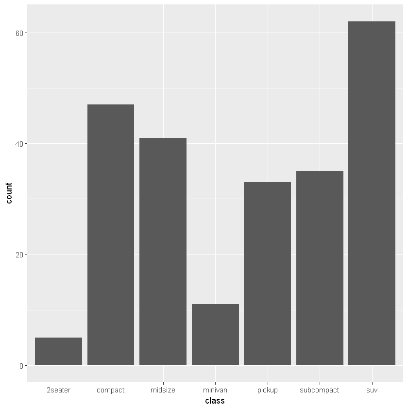
[3]:
g1 <- ggplot(mpg, aes(x=class))
上面这个例子不会输出任何结果。函数 ggplot() 的作用仅仅是指定一些全图适用的参数,比如绘图使用的数据集、x/y 轴将使用的列(上面用 aes 参数指定了)、分组、颜色等等。ggplot2 绘图分为几个类似图层的概念:
setup: 指定初始化参数,一般是 ggplot() 函数。
geometries:图形层。即绘图的主题,一般是以
geom_开头的命令,比如geom_bar()。labels:标签层,图像的 x/y 轴刻度,以及轴标题、图像总标题。
themes:主题层。包括图像的图例、字体、配色等等。
faceting:图形的分组控制命令。
图像必须有图形层才能显示主体,例如:
[4]:
g1 + geom_bar() # 注意到赋值的对象直接可以使用在“+”运算中
或许对于 ggplot() 函数与其 aes 参数还有诸多不解之处,在下面将逐渐提到。我们常用的 aes 参数有:
x= / y= :这是基本参数。
fill= / color= :一般指定一个因子,让 ggplot2 自动根据因子的水平数分配颜色并绘图。
shape= :类似上,不过是自动分配点样式。
6.2. 绘图命令
6.2.1. 条形图:geom_bar()
上面给出了很简单的一个条形图的例子,下面展示更多的用法:
6.2.1.1. 纵轴数值:aes(stat=)
默认纵轴是 x 轴上各离散类的计数(Count),对应的默认参数是 geom_bar(stat="count")。如果想用其他值代替,需要在 ggplot() 中指定 aes(y=) 参数,并且在条形图函数中改动为 geom_bar(stat="identity")。
[5]:
# 以各类内部的排放量作为对应的 y 值,进行累加
ggplot(mpg, aes(x=class, y=displ)) +
    geom_bar(stat="identity")

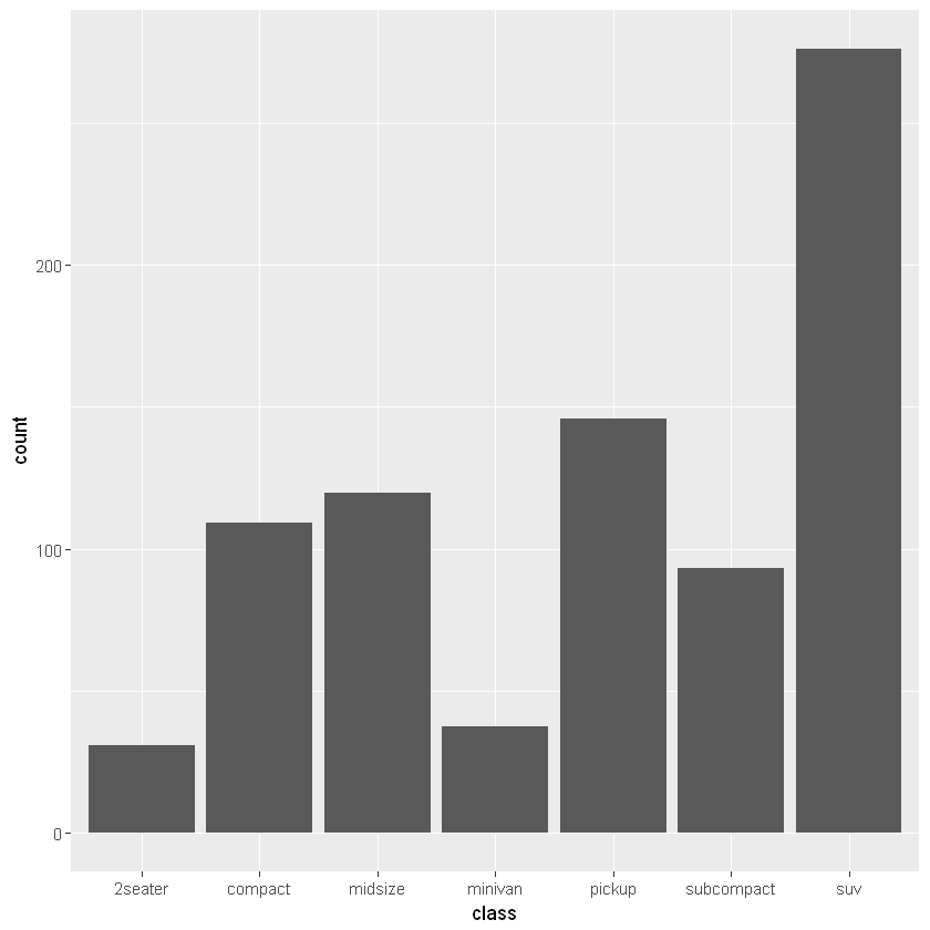
6.2.1.2. 权重:aes(weight=)
下面的语句完成了同样的任务,只不过权重相当于使用了乘法。
[6]:
# 权重。计算每个 class 内的排放总量
ggplot(mpg, aes(class)) +
    geom_bar(aes(weight=displ))
6.2.1.3. 填充:aes(fill=)
[7]:
# 每个 class 下,按照 drv 的水平(三个)分别计数
ggplot(mpg, aes(class)) +
    geom_bar(aes(fill=drv))
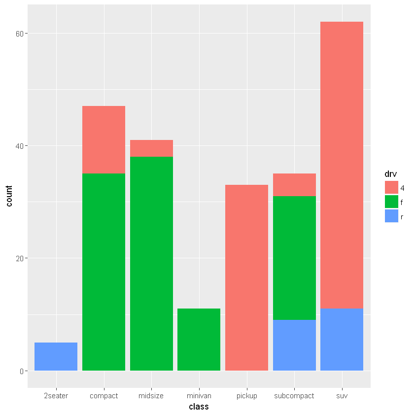
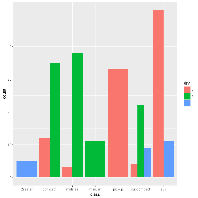
6.2.1.4. 并列 / 等高:geom_bar(position=)
默认的参数是 position=stack:
[8]:
ggplot(mpg, aes(class)) +
    geom_bar(aes(fill=drv), position="dodge")
[9]:
ggplot(mpg, aes(class)) +
    geom_bar(aes(fill=drv), position="fill")

6.2.2. 箱形图:geom_boxplot()
[10]:
ggplot(mpg, aes(class, hwy)) +
    geom_boxplot(varwidth = TRUE)
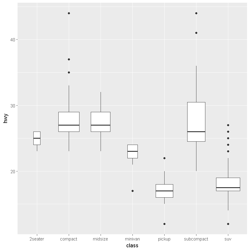
箱形图主题用 fill 参数指定填充颜色,color 参数指定边框颜色。
对于箱形图外侧的异常点,可以用 outlier 开头的参数进行控制。以下是它们的默认值:
outlier.shape = 19 点样式
outlier.size = 1.5 点大小
outlier.stroke = 0.5 边线宽
outlier.color = NULL 边线颜色
outlier.fill 填充颜色(需要点样式支持)
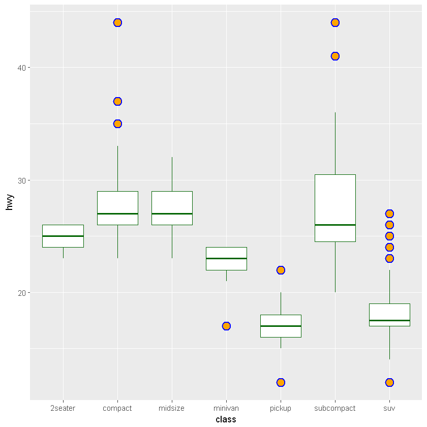
[11]:
ggplot(mpg, aes(class, hwy)) +
    geom_boxplot(fill = "white", color = "darkgreen",
                 outlier.shape=21, outlier.size=4, outlier.stroke = 1,
                 outlier.color = "blue", outlier.fill = "orange")
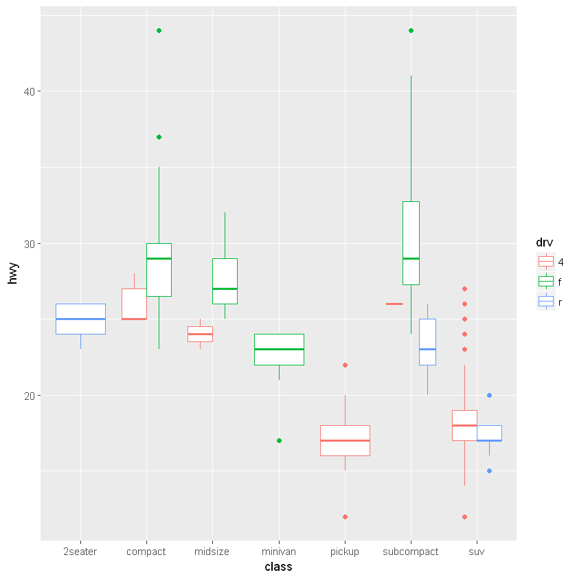
[12]:
# 并列箱形图的画法。注意只有 subcompact 类型的车辆有三种 drv 数据
ggplot(mpg, aes(class, hwy)) +
    geom_boxplot(aes(color = drv), fill="white")
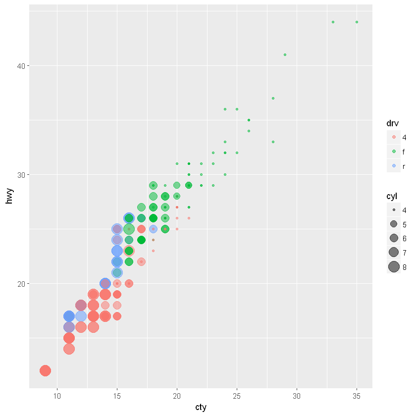
6.2.3. 散点图:geom_point()
最简单的一类图像。
[13]:
# 根据驱动方式,填充不同颜色;根据发动机数量,选择不同点大小。
# 在数据量大或有重复点时,更改 alpha 值是不错的选择
ggplot(mpg, aes(cty, hwy)) +
    geom_point(aes(color = drv, size=cyl), shape=19, alpha=0.5)
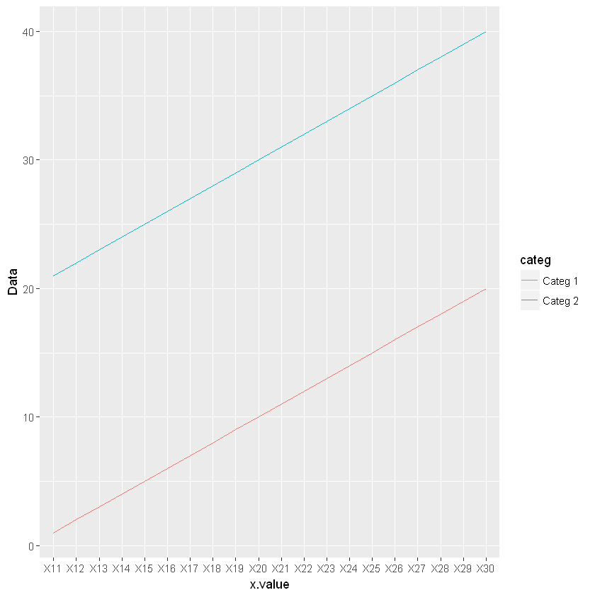
6.2.4. 折线图:geom_line()
[14]:
dt <- data.frame(Data = 1:40,
                 x.value = rep(paste("X", 11:30, sep=""), 2),
                 categ = c(rep("Categ 1", 20), rep("Categ 2", 20)))

# 若不指定 group,无法用离散数据作为 x 轴来正确作图
# 有时候可以通过 group=1 来强制连接所有的点成线
ggplot(dt, aes(x=x.value, y=Data, group=categ, color=categ)) +
    geom_line()
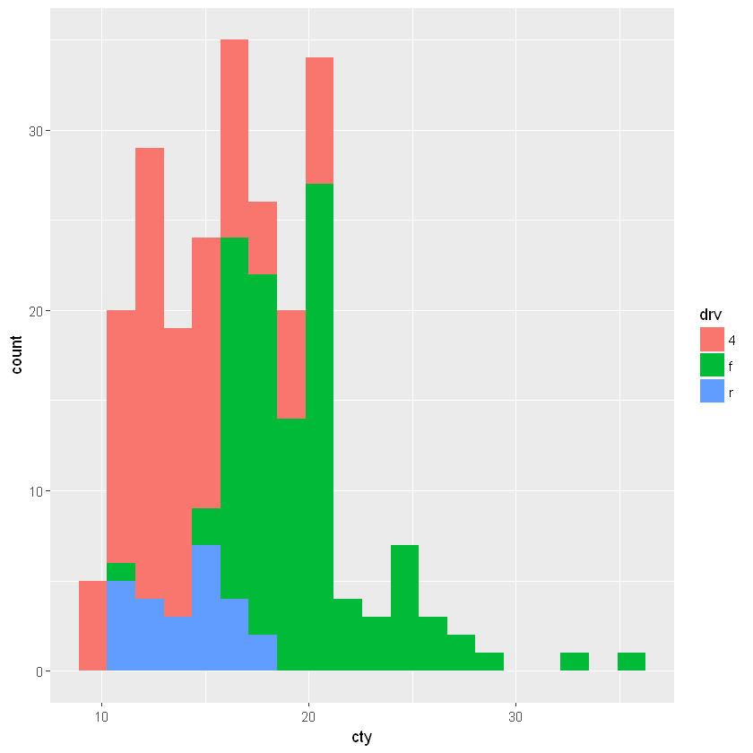
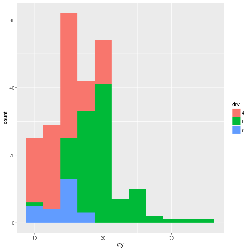
6.2.5. 直方图:geom_histogram()
参数 bins 指定组的个数, binwidth 则指定每个组的宽度。
[15]:
ggplot(mpg, aes(cty, fill=drv)) +
    geom_histogram(bins=20)
[16]:
ggplot(mpg, aes(cty, fill=drv)) +
    geom_histogram(binwidth=2.5)
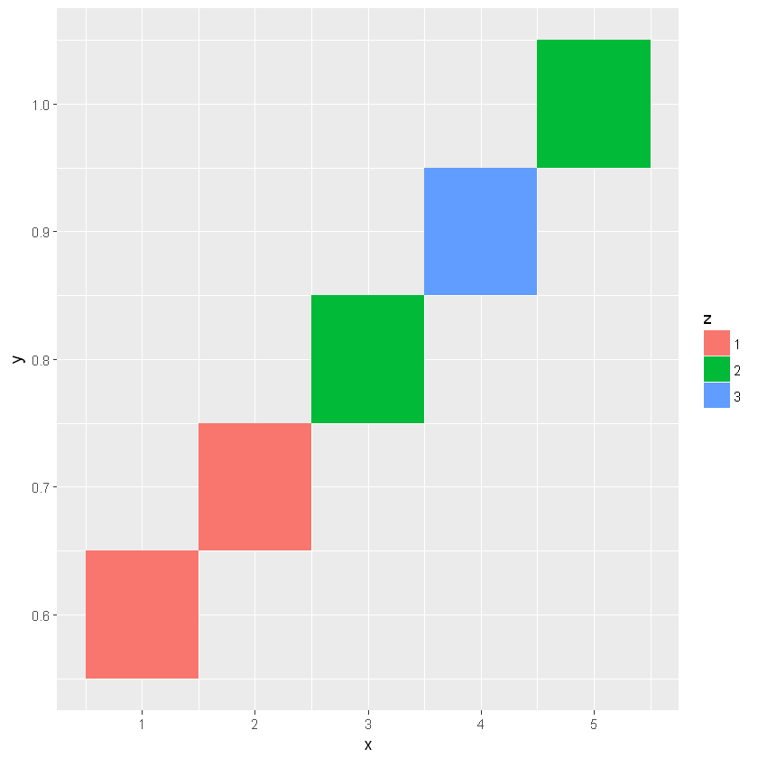
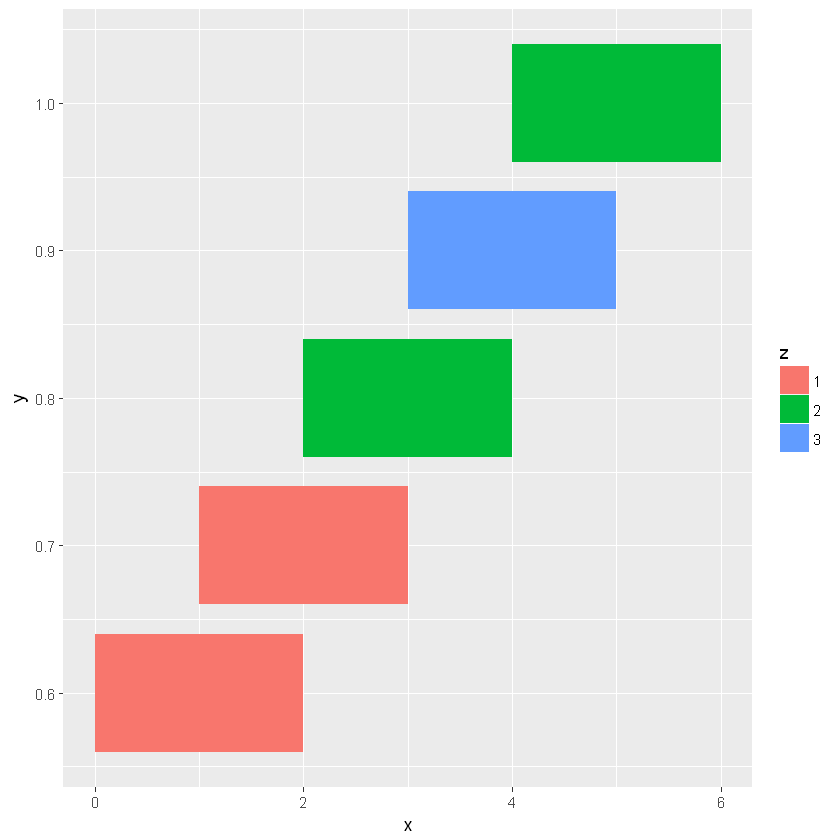
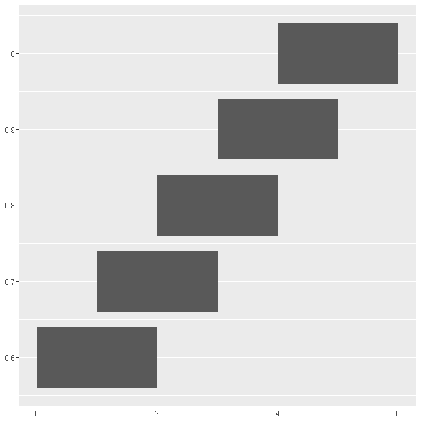
6.2.6. 矩形图:geom_rect() / geom_tile()
两者功能相同,但参数有区别。前者指定 xmin/xmax/ymin/ymax 四个角点,后者指定矩形中心坐标 x,y 以及矩形的宽与高 width/height。
[17]:
dt <- data.frame(x=1:5, y=(6:10)/10, w=rep(2, 5), h=rep(0.08, 5), z=factor(c(1,1,2,3,2)))

ggplot(dt, aes(x, y)) +
    geom_tile(aes(fill=z))
[18]:
ggplot(dt, aes(x, y, width = w, height = h)) +
    geom_tile(aes(fill=z))
[19]:
# 改用 geom_rect 绘制
ggplot(dt, aes(xmin = x - w / 2, xmax = x + w / 2, ymin = y - h / 2, ymax = y + h / 2, width = w, height = h)) +
    geom_rect()
6.3. 主题命令:theme()
略。这其中的部分功能也可以由 guide() 命令代完成。