统计绘图函数
本章介绍通用的统计绘图函数,比如直方图、箱型图等。
[1]:
import numpy as np
from matplotlib import pyplot as plt
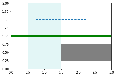
水平或竖直的线/矩形:ax.axhline / axhspan
用 axhline/axvline 绘制水平线/竖直线,用 axhspan/axvspan 绘制水平矩形/竖直矩形。
需要注意,下例中所有 xmin/xmax 参数是一个相对比例。比如 axhline 中的 xmin=0.25, xmax=0.75 表示从图像的左 1/4 处画起、到右 1/4 处结束。由于用 axis(...) 命令给出了横坐标的绘图范围是 [0, 3],因此这个 axhline 实际上是从横坐标 0.75 处画到 2.25 处。
[2]:
f, ax = plt.subplots()

ax.axis([0, 3, 0, 2])
ax.axhline(1, lw=8, color='g')
ax.axhline(y=1.5, ls="--", lw=2, xmin=0.25, xmax=0.75)
ax.axvline(2.5, color="yellow")

ax.axhspan(0.25, 0.75, xmin=0.5, facecolor='0.5')
ax.axvspan(0.5, 1.5, facecolor="#74D2D5", alpha=0.2)

plt.show()
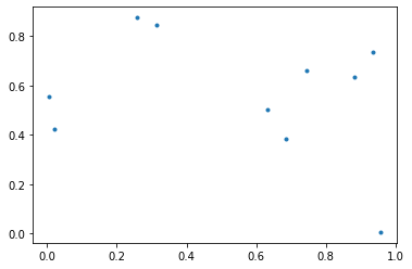
散点图:ax.scatter
散点图将多维(一般二维)数据用点绘制出来,一般是为了揭示不同维之间的关系。
如果不显示点的大小,最简单的散点图可以用 plot(..., '.') 绘制:
[3]:
np.random.seed(230)
x, y = np.random.rand(2, 10)

f, ax = plt.subplots()
ax.plot(x, y, '.')

plt.show()
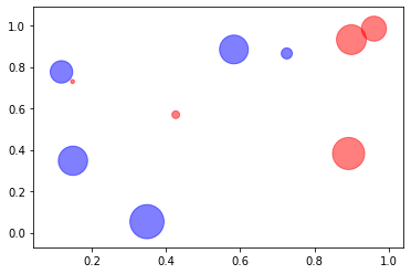
言归正传,正常的散点图用 ax.scatter(x, y, s=None, c=None, ...):
s:数组,每个点的大小。c:列表,每个点的颜色。marker='o':所有点的点样式。
[4]:
np.random.seed(233)
x, y = np.random.rand(2, 10)
np.random.seed(666)
point_size = 1000 * np.random.rand(10)

f, ax = plt.subplots()
ax.scatter(x, y, s=point_size, c=["b", "r"] * 5, alpha=0.5)
plt.show()
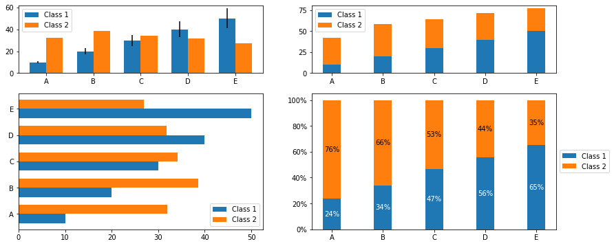
条形图:ax.bar / barh
条形图按多个分组来展示数据。用 bar 绘制竖立的条形图,或者用 barh 绘制横置的。
基本用法:
ax.bar(x, height, width=0.8, ...)
x:一维数组,长度与组个数相同,给出条形图的每组的水平位置。在默认的align='center'参数下,条形图每组的下端正中与x数组中每个元素对齐。你可以指定align='edge'来让每组的下端左侧与x中的位置对齐。height:条形图的高,即数据。应该与x等长。width:条形图的宽度。
下例的第四幅子图用到了 matplotlib.ticker.PercentFormatter 来将纵轴的刻度改为百分数,读者可以参考之前的坐标轴刻度章节,或者官方 Tick formatters 示例。
[5]:
import matplotlib.ticker as ticker

bar_width = 0.35
groups = np.arange(5)
y1 = np.linspace(10, 50, 5)
np.random.seed(0)
y2 = np.random.rand(5) * 40 + 10

f, ax = plt.subplots(2, 2, figsize=(14, 6), gridspec_kw = {'height_ratios':[1, 2]})
# 并列竖立条形图
ax[0,0].bar(groups, y1, bar_width, label="Class 1",
          yerr=2 * groups + 1)
ax[0,0].bar(groups + bar_width, y2, bar_width, label="Class 2")
ax[0,0].set_xticks(groups + bar_width / 2)
ax[0,0].set_xticklabels(list("ABCDE"))
ax[0,0].legend(loc="upper left")

# 堆叠竖立条形图
ax[0,1].bar(groups, y1, bar_width, label="Class 1")
ax[0,1].bar(groups, y2, bar_width, bottom=y1, label="Class 2")
ax[0,1].set_xticks(groups)
ax[0,1].set_xticklabels(list("ABCDE"))
ax[0,1].legend(loc="upper left")

# 横置条形图
ax[1,0].barh(groups, y1, bar_width, label="Class 1")
ax[1,0].barh(groups + bar_width, y2, bar_width, label="Class 2")
ax[1,0].set_yticks(groups + bar_width / 2)
ax[1,0].set_yticklabels(list("ABCDE"))
ax[1,0].legend(loc="lower right")

# 堆叠竖立百分比条形图(附百分比数字)
y1_percent = y1 / (y1 + y2)
y2_percent = y2 / (y1 + y2)
ax[1,1].bar(groups, y1_percent, bar_width, label="Class 1")
ax[1,1].bar(groups, y2_percent, bar_width, bottom=y1_percent, label="Class 2")
## 加上百分比字串
for k in range(len(groups)):
    ax[1,1].text(groups[k], y1_percent[k]/2, r"{:.0%}".format(y1_percent[k]),
                 color="w", ha="center", va="center")
    ax[1,1].text(groups[k], y2_percent[k]/2 + y1_percent[k],
                 r"{:.0%}".format(y2_percent[k]), color="k", ha="center", va="center")
ax[1,1].set_xticks(groups)
ax[1,1].set_xticklabels(list("ABCDE"))
ax[1,1].legend(loc="center left", bbox_to_anchor=(1.0, 0.5))
## 设置 y 轴刻度
ax[1,1].yaxis.set_major_formatter(ticker.PercentFormatter(xmax=1, decimals=0))

plt.show()
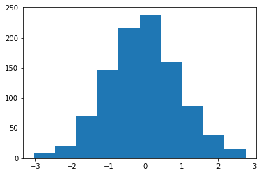
直方图:ax.hist
不同于条形图,直方图绘制的是一维的数据,展现数据的频数或者频率。
最简单的直方图 ax.hist(x),可以是单参数的:
[6]:
np.random.seed(0)
x = np.random.normal(0, 1, 1000)  # 标准正态

f, ax = plt.subplots()
ax.hist(x)
plt.show()
下面是我认为的几个常用参数:
ax.hist(x, bins=None, density=None, weights=None, histtype='bar', ...)
x:直方图的一维数据。bins:控制分组的参数。如果传入整数,就会对应自动分为几组。
如果传入列表,会按列表中的数给出分组。比如
[1,2,3,4],会将区间[1,2)(左闭右开,即包含1不包含2) 与[2,3)分为一组。但是列表中的最后一组将是双侧闭区间:[3,4]。如果传入字符串(较少用到),请参考 Numpy 文档中 histogram_bin_edges¶ 函数的 bins 参数。
density:(不常使用)控制图像密度的参数。设为 True 时将在绘图时对数据进行归一化,使直方图下方的面积求和为 1。该“面积求和为 1”与每个组的宽度有关,并不是常规统计意义上的密度。除非组宽是1,否则设置
density=True并不能得到频率图;频率直方图可以参考weights参数。旧版本有一个与现有的 density 参数相关的 normed 参数,但它即将被废弃。
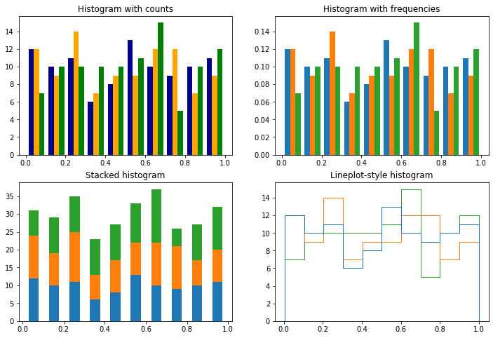
weights:控制每个数据点的权重。常规的直方图每个数据点出现 1 次,就记 1 频数;因此每个数据点权重均是 1。下例的图 2 用数据点总数的倒数作为权重,给出了一个频率直方图的实现。histtype:控制直方图类型。'bar':默认的直方图。多维数据会在组内并排排列。'barstacked':多维数据会在组内堆叠排列。。'step':用阶梯折线图(lineplot)代替了直方图,参考下例的图3。'stepfilled':下方用颜色填充的阶梯折线图。
几个例子(注意例中各图纵坐标刻度的区别):
[7]:
np.random.seed(0)
x = np.random.rand(100, 3)
bins_num = 10

f, ax = plt.subplots(2, 2, figsize=(12, 8))
ax = ax.ravel()

# 频数
ax[0].hist(x, bins_num, color=("darkblue", "orange", "g"))
ax[0].set_title("Histogram with counts")

# 频率
ax[1].hist(x, bins_num, weights=np.ones_like(x)/x.shape[0])
ax[1].set_title("Histogram with frequencies")

ax[2].hist(x, bins_num, histtype="bar", stacked=True, rwidth=0.5)
ax[2].set_title("Stacked histogram")

ax[3].hist(x, bins_num, histtype='step')
ax[3].set_title("Lineplot-style histogram")

plt.show()
核密度曲线
Matplotlib 没有简洁的核密度曲线图(kernel density plot)的实现,这件事恐怕自从 matplotlib 风靡之日起就在被吐槽。相比之下,基于 matplotlib 的 seaborn 库 提供了一个很简单的 distplot 来实现这一功能,但在 matplotlib 里我们恐怕需要稍微多花一点功夫。
下例是频率直方图(通过 weights 参数转换为频率)与对应的 Gaussian 核密度曲线:
[8]:
from scipy.stats import gaussian_kde

values = list(range(1, 6))
freqs = [5, 15, 10, 60, 10]
x = np.concatenate([np.ones(f)*v for v, f in zip(values, freqs)])

density = gaussian_kde(x)
x_plot = np.linspace(min(x), max(x), 200)

f, ax = plt.subplots()
ax.hist(x, weights=np.ones_like(x)/len(x), color='tab:cyan')
ax.plot(x_plot, density(x_plot), 'tab:red')
ax.set_title("Frequency hist with Gaussian kernel density estimation")

plt.show()
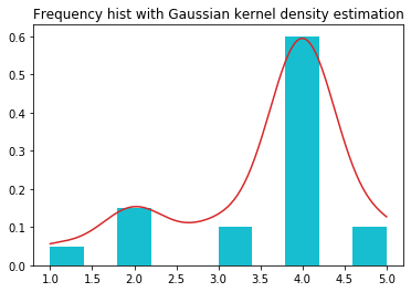
gaussian_kde 函数的 bw_method 参数的默认值是 'scott' 方法,读者也可以选用 'silverman' 方法。 除了接受这两种字串,bw_method 还可以直接接受数值作为 Scott factor(如上例)。默认的 Scott factor 的选值是:\(n^{-1/(d+4)}\),其中 \(n\) 是数据长,\(d\) 是数据集的维度。
更多关于 bw_method 参数的细节可以参考 Scipy.stats.gaussian_kde 页面的内容。
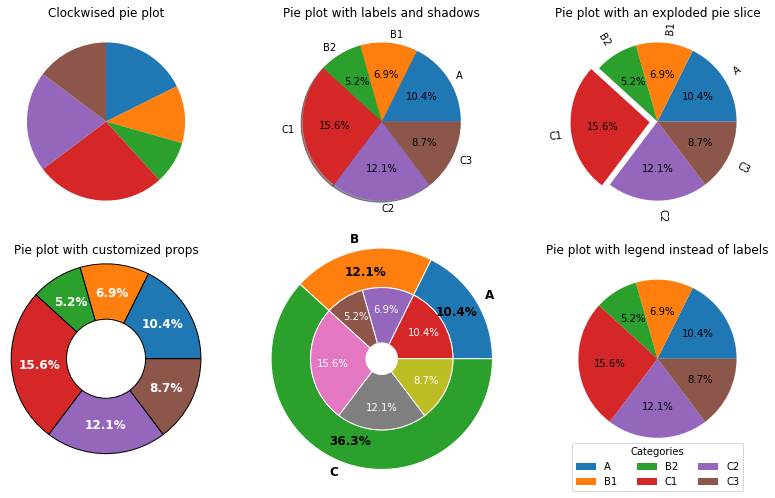
饼图:ax.pie
我讨厌饼图!非常讨厌!如果你一定要画饼图,并且玩很多视觉花招,那我不建议你用 matplotlib 来实现。
饼图的绘制指令的常用参数:
ax.pie(x, explode=None, ...)
explode=None:控制扇形区域向外“炸开”的距离,传入一个数组。radius=1:饼图半径。labels=None,colors=None:扇形区的标签与颜色。labeldistance:标签到圆心的距离。rotatelabels=False:旋转标签,使其文字方向指向圆心。
autopct=None:显示百分数。可以传入一个格式化字串,或者一个函数。如果原数据集已经是百分数,那么可以使用格式化字串
autopct="%.1f%%"显示含一位小数的百分数。下例中使用了较复杂的函数实现来针对不同的数据集情况。pctdistance=0.6: 在autopct有效时使用,指定百分数标签到圆心的距离。
startangle=0:开始绘制饼图的角度,从 X 轴正向开始逆时针旋转。counterclock=True:是否沿逆时针绘制,设为 False 是沿顺时针绘制。其他绘图参数:
wedgeprops:绘图属性,比如线型等。textprops:标签文字的属性。
[9]:
x = [[30], [20, 15], [45, 35, 25]]
x_flatten = [v for item in x for v in item]
labels = [["A"], ["B1", "B2"], ["C1", "C2", "C3"]]
labels_flatten = [v for item in labels for v in item]


def percentify(percent_num, total=100):
    return "{:.1f}%".format(percent_num/total*100)

f, ax = plt.subplots(2, 3, figsize=(14, 8))
ax = ax.ravel()

ax[0].pie(x_flatten, startangle=90, counterclock=False)
ax[0].set_title("Clockwised pie plot")

ax[1].pie(x_flatten, labels=labels_flatten, shadow=True,
          autopct=lambda k: percentify(k, sum(x_flatten)))
ax[1].set_title("Pie plot with labels and shadows")

explodes = np.zeros(len(x_flatten))
explodes[3] = 0.1  # 只炸开第4个扇形区
ax[2].pie(x_flatten, labels=labels_flatten,
          autopct=lambda k: percentify(k, sum(x_flatten)),
          explode=explodes, rotatelabels=True)
ax[2].set_title("Pie plot with an exploded pie slice")

ax[3].pie(x_flatten, radius=1.2, pctdistance=0.7,
          autopct=lambda k: percentify(k, sum(x_flatten)),
          textprops=dict(color='w', weight='bold', size=12),
          wedgeprops=dict(edgecolor='black', width=0.7))
ax[3].set_title("Pie plot with customized props")

x_outer = [sum(k) for k in x]
r, width_outer, inner_blank = 1.4, 0.5, 0.2
width_inner = r-width_outer-inner_blank
ax[4].pie(x_outer, radius=r, textprops=dict(size=12, weight='bold'),
          wedgeprops=dict(width=width_outer, edgecolor='w'),
          autopct=lambda k: percentify(k, sum(x_outer)),
          pctdistance=r-1.2*width_outer, labels=list("ABC"))
ax[4].pie(x_flatten, radius=r-width_outer,
          textprops=dict(color='w'),
          wedgeprops=dict(width=width_inner, ec='w'),
          autopct=lambda k: percentify(k, sum(x_flatten)),
          pctdistance=inner_blank+.7*width_inner)

patches, texts, autotexts = \
    ax[5].pie(x_flatten, autopct=lambda k: percentify(k, sum(x_flatten)))
ax[5].legend(patches, labels_flatten, title="Categories", ncol=3,
              loc="upper center", bbox_to_anchor=(0.5, 0.1))
ax[5].set_title("Pie plot with legend instead of labels")

plt.show()
箱型图:ax.boxplot
箱型图(也称盒须图)可以认为是五数概括(five number summary,即两个最值与三个四分位值;但最值的定义有所不同,下详)的一种可视化,主要由两部分组成:箱子与离群值(outliers)区。因为这几个概念的理解直接影响箱型图的读图,所以下面先简要谈谈这几个概念:
箱子:箱型图的主体当然是中间的箱子,其顶部一般对应上四分位值(或第三四分位,Q3,the 3rd quartile),即75分位值;底部一般是下四分位值Q1,即25分位值;这两个值之差(即箱子的高)称为四分位距(IQR,Interquartile range)。箱子中心的那根线是中位数(也即Q2)。所有的箱型图一般都遵循以上原则。
离群值区:不同箱型图的离群值区域规定可以不同。常见的方法是 Tukey 围栏(Tukey’s fences)定义的闭区间:
\begin{equation*} T(w) = [Q_1 - w\cdot IQR, Q_3 + w\cdot IQR] \end{equation*}
其中,\(w\) (须,whisker)是一个非负常数,而 \(IQR=Q_3-Q_1\) 即是上文提到的四分位距。下面是最朴素、可能也是最常见的离群值规则:
当 \(w=0\) 时,该围栏表示箱子的主体。
当 \(w=1.5\) 时,除了箱子主体,该围栏也将适度离群值(mild outliers)包括在内。
当 \(w=3\),时,除了箱子主体与适度离群值,该围栏也将极限离群值(extreme outliers)包括在内。在箱型图中,有时把此时围栏的上下限称为“最值”(虽然我本人并不太赞同这种称呼);这个最值与数据集的最值是不同的(因为还可能有在 \(T(3)\) 围栏外侧的点),注意区分。
对于更外侧的情形,这部分数据点有时也被标记为 far out。
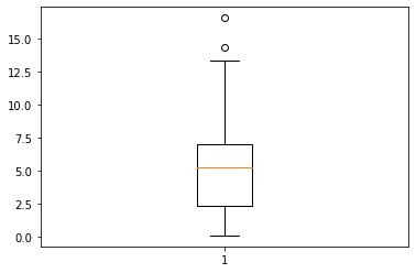
一个简洁的箱型图例子。
箱体中的橙色线是中位数。
箱体两侧的须的末端,标明了 \(T(w)\) 围栏的两个端点。
在 \(T(w)\) 围栏外侧的数据被称为异常值点(fliers),会单独以圆圈点的形式绘制出来。
Matplotlib 中的默认围栏取 \(w=1.5\),即它认为极限离群值属于异常值。
[10]:
np.random.seed(0)
x = np.concatenate((np.random.rand(90)*10, np.random.rand(10)*20))

f, ax = plt.subplots()
ax.boxplot(x)
plt.show()
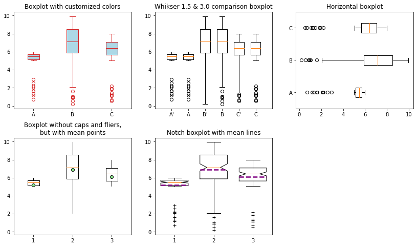
箱型图的常用参数
箱型图的绘制命令:
ax.boxplot(x, whis=1.5, vert=True, ...)
x:一维或多维的数据。whis:须(whisker)值,影响绘制时围栏的上下端点。默认是 1.5。vert:默认 True,即以竖直方式绘图。widths:箱型图在绘制时的箱体宽度。labels:每个箱型图的标签。notch:切口箱型图。切口在中位数处,切口宽度是中位数的 95% 置信区间。当
notch=True时,可配合使用bootstrap=True来使用 bootstrap 来估计该置信区间。
绘图参数:
箱子主体:显隐
showbox,外观boxprops。注意:箱子的前景色只能在patch_artists=True时使用。异常值点:显隐
showfliers,外观filerprops须:须外观
whiskerprops须的末端线的显隐
showcaps,须的末端线外观capprops,
中位数线:显隐
showmedians,外观medianprops均值点/线(默认关闭):显隐
showmeans,按线显示meanline,外观meanprops
下面的例子涵盖了上述所有参数:
[11]:
mu_shared, r = 5, [1, 5, 3]
np.random.seed(0)
x = np.random.rand(100, 3) * r + mu_shared
np.random.seed(123)
x = np.concatenate((x, np.random.rand(10, 3) * 3))

f, ax = plt.subplots(2, 3, sharey='col', figsize=(14, 8))
f.subplots_adjust(hspace=0.3)
ax = ax.ravel()

colors = {"line": 'tab:red', "face": 'lightblue'}
g = ax[0].boxplot(x, patch_artist=True, labels=list("ABC"))
for line in ['boxes', 'whiskers', 'means', 'medians', 'caps']:
    plt.setp(g[line], color=colors["line"])
## 论外的箱子前景色与异常值点的颜色。
plt.setp(g['fliers'], mec=colors["line"])  # mec=markeredgecolor,参考第一章
plt.setp(g['boxes'], facecolor=colors["face"])  # 前景色需要 patch_artist=True
ax[0].set_title("Boxplot with customized colors")

ax[1].boxplot(x, whis=3, labels="A' B' C'".split())
ax[1].boxplot(x, positions=np.arange(3)+1.5, labels=list("ABC"))
ax[1].set_title("Whikser 1.5 & 3.0 comparison boxplot")

ax[2].boxplot(x, vert=False, labels=list("ABC"))
ax[2].set_title("Horizontal boxplot")

ax[3].boxplot(x, showcaps=False, showfliers=False, showmeans=True,
              meanprops=dict(marker='o', mec='black', mfc='lightgreen', ms=6))
ax[3].set_title("Boxplot without caps and fliers,\nbut with mean points")

ax[4].boxplot(x, widths=0.7, showmeans=True, meanline=True, notch=True,
              meanprops=dict(ls='--', lw=2.5, color='purple'),
              flierprops=dict(marker='+'))
ax[4].set_title("Notch boxplot with mean lines")

ax[5].axis('off')

plt.show()
箱型图的细节概念*
本节是针对不太了解箱型图的读者的补充内容。对箱型图概念很熟悉的读者可以跳过。
我们来看一个模拟的例子:用符合正态分布 \(N(0,1)\) 的一维数据,模拟一下 Tukey 围栏:
[12]:
from scipy.stats import norm

mu, sigma, n = 0, 1, 5000
np.random.seed(1234)
x = np.random.normal(mu, sigma, n)

q1, q3 = np.percentile(x, 25), np.percentile(x, 75)
w, iqr = 1.5, q3 - q1
bpmin, bpmax = q1 - w*iqr, q3 + w*iqr

f, ax = plt.subplots(2, 1, sharex=True, gridspec_kw={'height_ratios':[3, 7]})
ax = ax.ravel()

# 绘制箱型图
ax[0].set_title("Boxplot & density plot of Normally choosen data")
ax[0].boxplot(x, vert=False, labels="X")
## 标出关键值的位置
maxmincolor, boxcolor = 'tab:blue', 'tab:orange'
[ax[0].axvline(lines, color=maxmincolor) for lines in (bpmin, bpmax)]
[ax[0].axvline(lines, color=boxcolor) for lines in (q1, q3)]

# 绘制 0.01%~99.99% 累计概率范围内的真实正态密度曲线
plt_x =  np.linspace(norm.ppf(.0001, mu, sigma),
                     norm.ppf(.9999, mu, sigma), n)
plt_y = norm.pdf(plt_x)
ax[1].plot(plt_x, plt_y, 'r')
## 显示 Tukey 围栏的数据
ax[1].text(-4, 0.3, f'box | min, max\n= {q1:.2f}, {q3:.2f}', color=boxcolor)
ax[1].text(-4, 0.2, f'{w} whisker | min, max\n= {bpmin:.2f}, {bpmax:.2f}', color=maxmincolor)

plt.show()
上例中:
模拟得到的箱子上下限(Q1, Q3)是:-0.65, 0.69
模拟得到的 \(w=1.5\) 的 Tukey 围栏上下限是: -2.65, 2.70.
而理论值(只针对数据服从标准正态分布的情形)是:
[13]:
q1_theory = norm.ppf(.25, mu, sigma)
q3_theory = norm.ppf(.75, mu, sigma)
iqr_theory = q3_theory - q1_theory
bpmin_theory = q1_theory - w * iqr_theory
bpmax_theory = q3_theory + w * iqr_theory
tukey_prob = norm.cdf(bpmax_theory) - norm.cdf(bpmin_theory)

print(f"Q1 = {q1_theory:.4f}, Q3 = {q3_theory:.4f}, 覆盖了 0.50 概率范围;\n" +
      f"T({w}) = [{bpmin_theory:.4f}, {bpmax_theory:.4f}],覆盖了 {tukey_prob:.4f} 概率范围。")
Q1 = -0.6745, Q3 = 0.6745, 覆盖了 0.50 概率范围;
T(1.5) = [-2.6980, 2.6980],覆盖了 0.9930 概率范围。