图像控制
在介绍统计图像等绘图命令之前,本节先介绍图像控制的命令,包括:
用
rcParams来设置默认参数子图的调整命令
标题
图例
坐标轴控制
坐标轴的取值区间、刻度
坐标轴的总标签、刻度标签
坐标轴网格线
双纵轴
文字命令
其他坐标系的绘制
对数坐标系
左手系
极坐标
关于线型与颜色的控制,请参考上一章节的内容。
[1]:
import numpy as np
from matplotlib import pyplot as plt
默认参数:mpl.rcParams
当使用 matplotlib 绘制多条曲线时,即使你没有指定每条曲线的颜色,matplotlib 也会自动用不同的颜色加以区分。这是因为 matplotlib.rcParams 这个字典变量的缺省值设置。我们在上一章已经介绍过,'C0'~'C9' 是 matplotlib 缺省的绘制颜色,我们可以查看当前的绘制颜色:
[2]:
import matplotlib as mpl
mpl.rcParams["lines.color"]
[2]:
'C0'
如果要更改默认参数的值,可以使用 mpl.rc() 命令(并可用 mpl.rcdefaults() 来重置)。但更多的情况下,我们只想在接下来的图像中变更默认值;这时请使用 plt.rc() 命令。下面是一个更改颜色循环的例子,借助了 cycler 库:
[3]:
from cycler import cycler

n = 4
x = np.linspace(0, 2*np.pi, 100)
k = np.arange(n) + 1
Y = np.sin(np.outer(k, x))

color_cycle = cycler('color', ['tab:blue', 'tab:orange', 'tab:green'])
plt.rc("axes", prop_cycle=color_cycle)
for row in range(n):
    plt.plot(x, Y[row], label=f"Line {row+1}")
plt.legend()
plt.show()
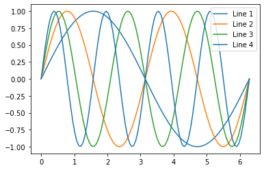
上例绘制了 4 条曲线,不过用 plt.rc 设定色环时只设定了 3 种,因此 Line 4 与 Line 1 采用了相同的颜色。如果要在接下来的章节中重置为到初始的配置,可以执行 plt.rcdefaults() 命令。
除了颜色,rcParams 还控制着众多的其他参数,就不在此赘述了。读者可以参考 Matplotlib API (v3.1.1) - matplotlib.rc 页面。
通用的绘图流程:plt.subplots
在上一章中我们已经介绍了绘图的方法。通常有两种:
直接使用
plt.plot()绘制。先声明
f, ax = plt.subplots(),然后绘制。
出于保存图像以及复用性的考虑,我推荐使用 subplots 方式。下面的内容也基本会以这种绘制为主。
除了上一章介绍的调用方式: plt.subplots(nrows, ncols, [sharex/sharey=False]),这里再介绍几个会用的参数:
figsize:总图的宽与高。例如figsize=(12,6)表示宽 12 高 6,单位英寸。也可以传入plt.figaspect(x)来设置高宽比为 x。subplot_kw:这是一个传递参数,并不经常使用。在此提及是因为在绘制极坐标图像时会用到:subplot_kw=dict(projection='polar')。gridspec_kw:一个控制各列高度之比或各行宽度之比的参数。例如gridspec_kw={'height_ratios':[1, 2]}表示第二行子图的高度将是第一行子图的两倍。
子图的间距调整
对 f, ax = plt.subplots(),我们可以使用 f.subplots_adjust 来调整子图间距:
left/right/bottom/top=0.125/0.9/0.1/0.9:默认的四侧边距。wspace=0.2:列间距,单位是平均子图宽度的倍数。hspace=0.2:行间距,单位是平均子图高度的倍数。
在下文的“图例”一节的例子中,就使用了 f.subplots_adjust(hspace=0.35) 这样的命令来调节子图行间距。
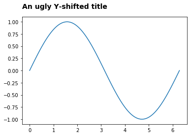
图像标题:ax.set_title
图像标题使用 ax.set_title() 来设置(但如果直接使用 plt.plot 绘图,那么请用 plt.title() 来设置标题。建议读者始终使用 ax 的方式进行绘图)。该命令支持的参数:
loc:标题的水平对齐方式。默认是'center'居中对齐,可用'left' / 'right'来控制。y: 控制标题与图像顶部的间距比例,比如例中的y=1.05。这个参数官方似乎没有介绍。pad:(本参数可能不如y参数直观)标题与图像顶部的间距,默认值是rcParams['axes.titlepad']。其它参数可以用
fontdict字典来控制,不过其键也能直接调用。可能用到的是`fontweight<https://matplotlib.org/3.1.1/api/text_api.html?highlight=fontweight#matplotlib.text.Text.set_fontweight>`__ 与fontsize(单位 pt)这两个键。
来看一个 ax.set_title() 的例子:
[4]:
x = np.linspace(0, 2*np.pi, 100)
y = np.sin(x)
f, ax = plt.subplots()
ax.plot(x, y)
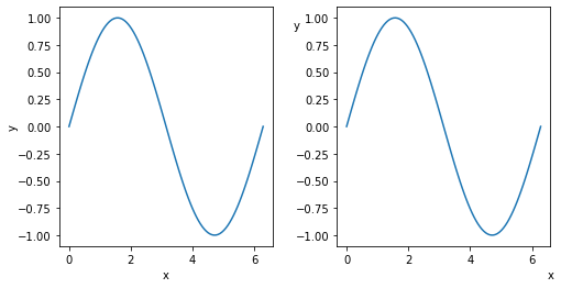
ax.set_title("An ugly Y-shifted title", y=1.05, loc='left',
fontsize=14, fontweight='heavy')
plt.show()
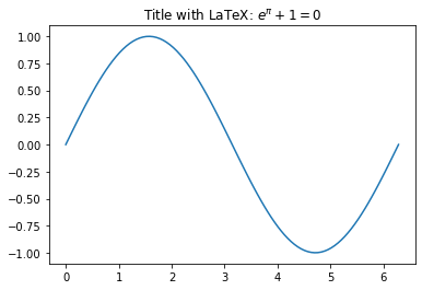
对于 LaTeX 用户,标题中也可以展示 LaTeX 数学字符:
[5]:
f, ax = plt.subplots()
ax.plot(x, y)
ax.set_title("Title with LaTeX: $e^\pi + 1 = 0$")
plt.show()
坐标轴标题:ax.set_xlabel
函数 ax.set_xlabel/set_ylabel 与 ax.set_title 的用法类似,也可以用 loc 参数控制水平对齐;不过与图像的间距参数由 labelpad 代替了 pad:
labelpad:与图像的间距。对ax.set_xlabel是竖直间距,对ax.set_ylabel是水平间距。rotation:坐标轴标题文字的旋转角度。如果给 Y 轴标值设置rotation=0,文字会变成正立的。x:(仅对ax.set_xlabel有效)控制水平位置,0是图像最左侧,1是图像最右侧。y:(仅对ax.set_ylabel有效)控制竖直位置,0是图下最下端,1是图像最顶端。
[6]:
x = np.linspace(0, 2*np.pi, 100)
y = np.sin(x)

f, axarr = plt.subplots(1, 2, figsize=plt.figaspect(.5))
f.subplots_adjust(wspace=.3)
axarr = axarr.ravel()
for ax in axarr:
    ax.plot(x, y)

axarr[0].set_xlabel("x")
axarr[0].set_ylabel("y", labelpad=-1)

axarr[1].set_xlabel("x", x=1)
axarr[1].set_ylabel("y", y=0.9, rotation=0, labelpad=-1)

plt.show()
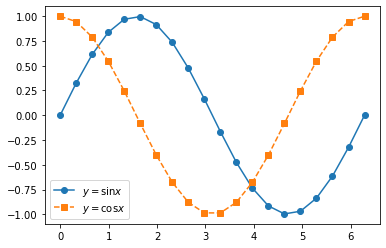
图例:ax.legend / f.legend
在 rcParams 的介绍中,我们其实已经展示了图例的用法,即在绘图命令中添加 label 参数,然后在绘制的最后使用 ax.legend 命令。
[7]:
x = np.linspace(0, 2*np.pi, 20)
y1, y2 = np.sin(x), np.cos(x)

f, ax = plt.subplots()
ax.plot(x, y1, 'o-', label="$y=\sin{x}$")
ax.plot(x, y2, 's--', label="$y=\cos{x}$")
ax.legend()
plt.show()
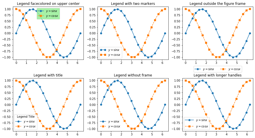
图例的实用参数很多,包括:
ncol:图例分为几列。以及列间距columnspacing=2.0。title:图例标题。默认 None 因此不显示。可以设置标题字体title_fontsize。图例的位置
loc:图例可以用loc参数手动指定,默认是自动选择(即赋值为0或者'best')。指定的方式可以用数字 0-10,或者英文组合:即upper/lower与left/right以及center的方位组合,有'upper right','lower center','center left'等共9种。bbox_to_anchor:传递一个类似(x_ratio, y_ratio)的比例值来指定图例的放置位置。负值可以将图例放置在图像外侧。
图例样式控制
frameon:图例是否显示边框True/False。此外还可设置底色facecolor与边框色edgecolor,颜色生效的前提是显示边框。numpoints:图例中绘制几个点。markerscale:图例中的点样式比例。markerfirst=False:图例是否从点还是线开始绘制。
图例尺寸与间距控制
borderpad=0.4:内侧边距,单位是字号大小的倍数。labelspacing=0.5:图例的项间距,单位同上。handletextpad=0.8:图例的样式与文字间距,单位同上。以及handlelength=2.0指定样式的长度。
下面是一些例子:
[8]:
fig_titles = [
    "Legend facecolored on upper center", "Legend with two markers",
    "Legend outside the figure frame", "Legend with title",
    "Legend without frame", "Legend with longer handles"
]

f, axarr = plt.subplots(2, 3, figsize=(15,8))
f.subplots_adjust(hspace=0.35)
axarr = axarr.ravel()
for t, ax in zip(fig_titles, axarr):
    ax.plot(x, y1, 'o-', label="$y=\sin{x}$")
    ax.plot(x, y2, 's--', label="$y=\cos{x}$")
    ax.set_title(t)

axarr[0].legend(loc="upper center", facecolor="lightgreen")
axarr[1].legend(numpoints=2)
axarr[2].legend(loc="center", ncol=2, bbox_to_anchor=(0.5, -0.18))
axarr[3].legend(title="Legend Title")
axarr[4].legend(frameon=False)
axarr[5].legend(handlelength=3, labelspacing=1)

plt.show()
最后,需要指出 f.legend 这个命令也是存在的,它能够画出当前 Figure 对象中所有带 label 的 Axes 对象的图例。我在日常使用中很少使用它,但我认为它的主要价值在于能够轻松处理双纵轴图像的图例。下例命令会将图例放置在顶部中央的外侧:
f.legend(loc='upper center')
但是,如果要将它的图例放置在图像内侧,需要配合另外两个参数。其中,bbox_to_anchor 的值要根据放置的位置变动,而 bbox_transform = ax.transAxes 无须变动。比如,要将图例放置在内侧的顶部中央:
f.legend(loc='upper center', bbox_to_anchor=(0.5,1), bbox_transform=ax.transAxes)
关于 f.legend 的例子,读者可以参考下文中双纵轴绘图一节的内容。
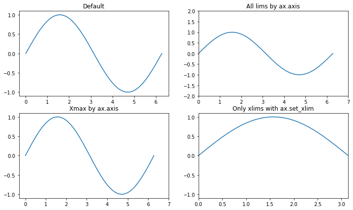
坐标轴区间:ax.axis / set_xlim
设置坐标轴区间有两种命令:
通过
ax.axis同时控制两个轴,也可以配合xmax/xmin/ymax/ymin参数控制每个轴的单侧。通过
ax.set_xlim/set_ylim来控制一个轴的两侧。
这两种方式都非常直截,例子如下:
[9]:
x = np.linspace(0, 2*np.pi, 100)
y = np.sin(x)

fig_titles = [
    "Default", "All lims by ax.axis",
    "Xmax by ax.axis", "Only xlims with ax.set_xlim"
]

f, axarr = plt.subplots(2, 2, figsize=(12,7))
axarr = axarr.ravel()
for t, ax in zip(fig_titles, axarr):
    ax.plot(x, y)
    ax.set_title(t)

# axarr[0]: Default
axarr[1].axis([0, 7, -2, 2])
axarr[2].axis(xmax=np.ceil(x.max()))
axarr[3].set_xlim([0, np.pi])

plt.show()
坐标轴刻度
坐标轴的刻度控制分为两个方面:
一个是坐标轴的刻度值
另一个是坐标轴的刻度标签。一般情形下,刻度标签都是与刻度值保持一致。
如无特殊说明,文中的刻度值指主刻度值。
坐标轴刻度值:ax.xaxis.set_major_locator / ax.set_xticks
最常用的方法应该是通过 ax.xaxis.set_major_locator 控制主刻度值的位置,也就是我们常说的最小刻度值。我们经常需要加载两个函数:
MultipleLocator(x):帮助在 x 的整数倍处设置刻度FormatStrFormatter(formatstr):以 formatstr 的形式设置刻度标签的格式
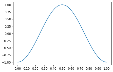
[10]:
from matplotlib.ticker import (MultipleLocator, FormatStrFormatter)

x = np.linspace(0, 1, 100)
y = -np.cos(2 * np.pi * x)

f, ax = plt.subplots()
ax.plot(x, y)
# 仅在 0.1 的整数倍处设置刻度,并将刻度标签保留2位小数
ax.xaxis.set_major_locator(MultipleLocator(0.1))
ax.xaxis.set_major_formatter(FormatStrFormatter('%0.2f'))
plt.show()
另一种方法是直接用 ax.set_xticks (或者等效的 ax.xaxis.set_ticks)来直接传递各个刻度处的值,请参考下面的刻度标签一节。
坐标轴刻度标签:ax.set_xticklabels
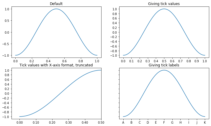
下面是一个综合的例子,直接将给定的值设置为刻度:
图 1 是默认刻度,刻度数量是横 6 竖 5
图 2~4 将横竖刻度数量均改为 11 个,且赋了已给定的值。此外:
图 3 将 X 轴刻度标签格式设置为保留 2 位小数,并截去了一半图像。这一步使用了
ax.xaxis.set_major_formatter函数。图 4 将 X 轴刻度标签改变成了英文字母,且移除了所有的 Y 轴标签。
[11]:
from matplotlib.ticker import FormatStrFormatter
import string

x = np.linspace(0, 1, 100)
y = -np.cos(2 * np.pi * x)

fig_titles = [
    "Default", "Giving tick values",
    "Tick values with X-axis format, truncated",
    "Giving tick labels"
]
xticknum, yticknum = 10, 10
xtickvalues = np.linspace(0, 1, xticknum+1)
ytickvalues = np.linspace(-1, 1, yticknum+1)

f, axarr = plt.subplots(2, 2, figsize=(12,7))
axarr = axarr.ravel()
for i in range(len(axarr)):
    ax = axarr[i]
    ax.plot(x, y)
    ax.set_title(fig_titles[i])
    if i > 0:
        ax.set_xticks(xtickvalues)
        ax.set_yticks(ytickvalues)

axarr[2].xaxis.set_major_formatter(FormatStrFormatter('%0.2f'))
axarr[2].axis(xmax=.5)

axarr[3].set_xticklabels(string.ascii_uppercase[:(xticknum+1)])
axarr[3].set_yticklabels([])

plt.show()
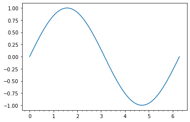
坐标轴次要刻度:ax.xaxis.set_minor_locator
可以使用 AutoMinorLocator 让 matplotlib 自行设置次要刻度,或者仿照上文的主刻度使用 MultipleLocator 函数。
[12]:
from matplotlib.ticker import AutoMinorLocator

x = np.linspace(0, 2*np.pi, 100)
y = np.sin(x)

f, ax = plt.subplots()
ax.plot(x, y)

ax.xaxis.set_minor_locator(AutoMinorLocator())
plt.show()
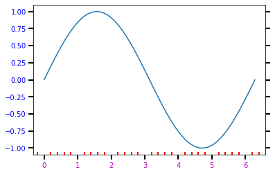
坐标轴刻度的绘图样式:ax.tickparams
刻度的绘图样式控制使用 ax.tickparams 命令:
选取
which:用both选中所有刻度,或者用major选中主刻度,或者用minor选中次要刻度。axis:例如用axis='x'来选择 x 轴的刻度。
pad:刻度线与刻度标签的间距刻度线
width/length:刻度线的宽度与长度,单位是 pt。color:刻度线的颜色direction:刻度线的朝向,可以设置为'in','out'或'both'bottom/top/left/right:是否在对应方向的框线上画出刻度线,True/False。
刻度标签
labelcolor:标签颜色。labelsize:标签字号,单位 pt;或者传入表示字号的字符串,比如'large'。labelrotation:标签旋转角度。labelbottom/labeltop/...:(类似bottom/top/...)是否在对应的方向显示刻度标签,True/False。
刻度网格(网格格式也可以通过
ax.grid直接控制)grid_color:网格线颜色。grid_linewidth/grid_linestyle:网格线的线宽/线型。grid_alpha:网格线的透明度,0为完全透明,1为完全不透明。
借用次要刻度一节的例子:
[13]:
x = np.linspace(0, 2*np.pi, 100)
y = np.sin(x)

f, ax = plt.subplots()
ax.plot(x, y)

ax.xaxis.set_minor_locator(AutoMinorLocator())

ax.tick_params(which='both', width=2)
ax.tick_params(which='major', length=7, labelcolor='blue', right=True)
ax.tick_params(which='minor', length=4, color='r', direction='in')
ax.tick_params(axis='x', labelcolor='m')

plt.show()
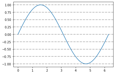
坐标轴刻度网格:ax.grid
与绘图命令类似,linestyle(ls),linewidth(lw),color 与 alpha 参数均可以在 ax.grid 中使用:
[14]:
x = np.linspace(0, 2*np.pi, 100)
y = np.sin(x)

f, ax = plt.subplots()
ax.plot(x, y)
ax.grid(axis='y', ls='--', lw=2, color='0.7')
plt.show()
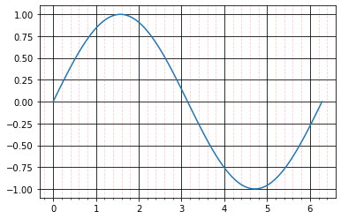
除了用 axis='x'/'y' 来控制,也可以用 which='major'/'minor'/'both' 来控制。关于这点,读者可以参考上文中 ax.tick_params 部分的内容。以下是一个例子:
[15]:
x = np.linspace(0, 2*np.pi, 100)
y = np.sin(x)

f, ax = plt.subplots()
ax.plot(x, y)
ax.xaxis.set_minor_locator(AutoMinorLocator())

ax.grid(which='major', ls='-', color='k')
ax.grid(which='minor', ls='--', color='r', alpha=0.2)

plt.show()
坐标轴的高级控制
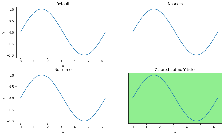
坐标轴/框的显示:ax.set_axis_off / set_frame_on
这里展示三种方法来改变坐标轴元素的显示与隐藏:
ax.set_axis_off():隐藏所有 axes,即 frame 与 tick 均不显示。ax.set_frame_on(False):仅隐藏 frame. 如果要隐藏 frame 的某几条边,参考下文中坐标轴骨架ax.spines部分的内容。ax.xaxis.set_visible(False):仅隐藏单个轴的 ticks.
以下是例子。坐标轴的背景颜色使用 ax.set_facecolor 更改。
[16]:
x = np.linspace(0, 2*np.pi, 100)
y = np.sin(x)

fig_titles = [
    "Default", "No axes",
    "No frame", "Colored but no Y ticks"
]

f, axarr = plt.subplots(2, 2, figsize=(12, 7))
f.subplots_adjust(hspace=0.3)
axarr = axarr.ravel()
for t, ax in zip(fig_titles, axarr):
    ax.plot(x, y)
    ax.set_xlabel("x")
    ax.set_ylabel("y")
    ax.set_title(t)

# axarr[0]: Default
axarr[1].set_axis_off()
axarr[2].set_frame_on(False)
axarr[3].set_facecolor("lightgreen")
axarr[3].yaxis.set_visible(False)
plt.show()
坐标轴骨架:ax.spines
通过设置坐标轴框架的显隐,可以更好地绘制符合“数学审美”的图像,即画出 X 轴与 Y 轴,而不是一个外接框。
下面的例子通过 ax.spines[...].set_visible 来控制四面边框的显隐,并用 ax.spines[...].set_position 的方式移动边框的位置,以此模仿正常的坐标轴的效果:
[17]:
x = np.linspace(-np.pi, np.pi, 100)
y = np.sin(x)

fig, ax = plt.subplots()
ax.plot(x, y)

ax.spines['right'].set_visible(False)
ax.spines['top'].set_visible(False)
ax.spines['bottom'].set_position(('data', 0))
ax.spines['left'].set_position(('data', 0))

ax.set_xlabel("X", x=1)
ax.set_ylabel("Y", y=0.95, rotation=0)
ax.yaxis.set_major_locator(MultipleLocator(0.5))
ax.set_xlim([-4, 4])

plt.show()
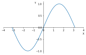
其中 MultipleLocator 的使用在前文已经介绍过。不过相比真正严格的绘图,上例仍显不足:
坐标轴没有箭头
刻度、坐标轴、图像之间相互重叠了
毕竟本例只是一个粗糙的例子。我会在之后寻找是否有更好的解决方案。
双纵轴:ax.twinx
双纵轴本质上是两个共享 x 轴图像的叠加绘制。
注意,由于双纵轴使用了两个 Axes 对象,所以绘制图例时,使用 f.legend 而不是 ax.legend。
[18]:
x = np.linspace(1, 10, 1000)
y1 = np.power(2, x)
y2 = np.power(x, -1)
label_fs = 12
ax_color, ax_twin_color = 'blue', 'red'

f, ax = plt.subplots()
ax.plot(x, y1, color=ax_color, label='ax')
ax.tick_params(axis='y', labelcolor=ax_color)
ax.tick_params(which='both', labelsize=label_fs)
ax.set_xlabel('X')
ax.set_ylabel('Y1')

ax_twin = ax.twinx()
ax_twin.plot(x, y2, color=ax_twin_color, label='ax twin')
ax_twin.tick_params(axis='y', labelcolor=ax_twin_color, labelsize=label_fs)
ax_twin.set_ylabel('Y2')

f.legend(loc='upper center', bbox_to_anchor=(0.5,1), bbox_transform=ax.transAxes)
plt.show()
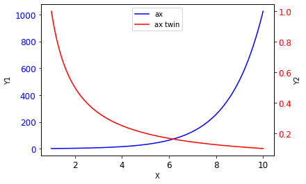
类似的,也可以用 ax.twiny 绘制双横轴;不过我尚未遇到需要双横轴的场合。
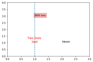
添加文字:ax.text / annotate
最简单的是 ax.text,直接输出文字:
[67]:
f, ax = plt.subplots()
ax.axvline(1, ls='--')

# 单独使用字号控制命令
ax.text(2, 1, 'Hmm', fontsize=12)
ax.text(1, 1, 'Two lines \n text ', horizontalalignment='center',
         fontdict={'size': 12, 'color': 'r'})

# 用 bbox 参数控制背景框
ax.text(1, 3, 'With box', bbox=dict(facecolor='r', alpha=0.3))

ax.axis([0, 3, 0, 4])
plt.show()
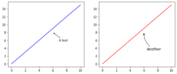
其次是 annotate,这个参数比较复杂,细节读者可以参考文档。一些可能用到的箭头:'-' / '->' / '-|>' / '|-|' / '<->' 等。
[68]:
f, (ax1, ax2) = plt.subplots(1, 2, figsize=(10, 4))
ax1.plot([0, 10], [0, 15], 'b')
ax1.annotate(r'A text', xy=(6,8), xytext=(20, -30), textcoords='offset pixels',
             arrowprops=dict(arrowstyle='->'))

ax2.plot([0, 10], [0, 15], 'r')
ax2.annotate(r'Another', xy=(6,8), xytext=(10, -60),
             textcoords='offset pixels', fontsize=12,
             # 指定圆弧半径,负值表示顺时针画弧
             arrowprops=dict(arrowstyle='-|>',
                             connectionstyle='arc3, rad=-0.3'))

plt.show()
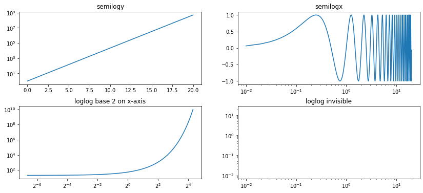
其他坐标系
除了正常的、等刻度坐标系,我们可能还需要用到其他坐标系:
对数坐标系
另外,除了正常的右手系,我们还可能用到:
左手坐标系
极坐标系
对数坐标系:ax.loglog / semilogx / semilogy
本节介绍:
loglog:双轴均为对数semilogx/semilogy:半对数
[19]:
x = np.arange(0.01, 20, 0.01)

f, ax = plt.subplots(2, 2, figsize=(14, 6))
f.subplots_adjust(hspace=0.3)

ax[0,0].semilogy(x, np.exp(x))
ax[0,0].set_title("semilogy")

ax[0,1].semilogx(x, np.sin(2 * np.pi * x))
ax[0,1].set_title("semilogx")

ax[1,0].loglog(x, 20*np.exp(x), basex=2)
ax[1,0].set_title("loglog base 2 on x-axis")

ax[1,1].loglog(x, x, visible=False)
ax[1,1].set_title("loglog invisible")

plt.show()
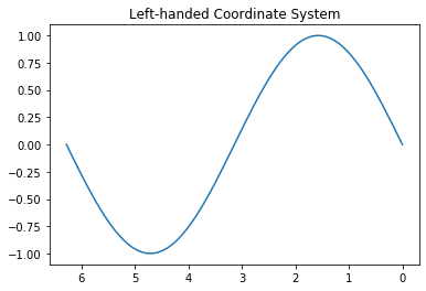
左手坐标系:ax.invert_xaxis
实质上是在绘图之后,用 ax.invert_xaxis 翻转了 X 坐标轴。
[21]:
x = np.linspace(0, 2 * np.pi, 100)
y = np.sin(x)

plt.close("all")
f, ax = plt.subplots()
ax.plot(x, y)
ax.set_title("Left-handed Coordinate System")

ax.invert_xaxis()
plt.show()
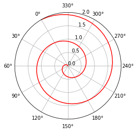
极坐标系:subplot_kw 参数
极坐标系的绘制只需向 plt.subplots 命令传递一个 subplot_kw 参数:
[25]:
x = np.linspace(0, 2 * np.pi, 100)
y = -np.sin(x)

# 或者传入:dict(polar=True)
fig, ax = plt.subplots(subplot_kw=dict(projection='polar'))
ax.plot(x, y)

plt.show()
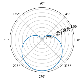
其他可以参考官方文档 Polar Axes,这里介绍几个可能用到的:
角度(xaxis)
set_thetalim/set_thetamax/set_thetamin:设置角度范围。set_theta_direction:设置角旋转方式。1 (或clockwise)是逆时针,-1 (或counterclockwise)是顺时针。set_theta_zero_location:设置零角度的位置,参数loc='N'表示在正上方、offset=表示相对于loc的逆时针角度值。
半径(yaxis)
set_rlabel_position:设置半径标签的位置,传入角度值。set_rlim/set_rmax/set_rmin:设置半径范围。set_rticks:设置半径标签。
[60]:
r = np.linspace(0, 2, 100)
theta = 2 * np.pi * r

fig, ax = plt.subplots(subplot_kw=dict(projection='polar'))
ax.plot(theta, r, 'red')

ax.set_xticks(np.linspace(0, 2*np.pi, 12, endpoint=False))
ax.set_theta_zero_location(loc='N', offset=30)

ax.set_rmax(2)
ax.yaxis.set_major_locator(MultipleLocator(0.5))
ax.set_rlabel_position(-45)

plt.show()